Our experience of visual perception is not absolute; it is shaped by a sensory perception of
relationships. This applies similarly to our perception of color and of dark/light relationships.
The slide-bar graphic above offers an opportunity to experience this. The inside square is a fixed
value, but if you work the slide bar to change the dark/light value of the square that surrounds
this inner square, the inner square will appear to change. This is a demonstration that our
perceptions are based on an assessment of relationships; there are no absolutes.
Concept 02
Josef Albers' Water Analogy
In his book Interaction of Color, Josef Albers uses a tactile water temperature analogy to describe
the relative nature of color perception. Set up three bowls of water, one hot, one cold, and one
lukewarm. If you put one hand in the hot water, the other in cold water, and then, after a minute or
so, put both into the lukewarm water, the temperature of the lukewarm water will not feel the same
to the two hands. By working the slide bar below the graphic above, you can demonstrate for yourself
that the same principle applies to our visual perception of color.
Concept 03
The Dynamic Nature of Color Perception: The Troxler Effect
+
Focus your gaze on the black cross
Seek to focus your gaze on the black cross in the square above. You may notice, with some
concentrated effort to keep your gaze fixed, the colors begin to fade. If you really concentrate,
you may be able to get the colors to fade almost entirely (and get the square surrounding the blurry
colors to go entirely white). The instant you shift your gaze, or perhaps even just blink, the
colors will re-appear.
This graphic, known as The Troxler Effect (first noticed by Swiss doctor Ignaz Vital Troxler in
1804), demonstrates graphically that it takes two phenomena for us to experience color:
1. Our eyes need to be moving. Mostly we are unaware of the rapid eye movement
called micro-saccades that helps generate our sensation of color sensation. The success of this
exercise is related to our ability to quiet this rapid eye movement.
2. We need to be perceiving light of differing wavelengths. The sensation of color
is all about the perception of light of differing wavelengths. The differing wavelengths are an
expression of light carrying different energy levels. Our Energy Theory of Color is an outlook that
emphasizes our visual perception as an assessment and experience of these energy relationships.
Concept 04
The Gelb Effect
Visual perception is built from a discernment of relationships. This is true of both color
relationships and relationships of darks and lights. In this exercise the gray circle appears to
grow lighter or darker in relation to the surrounding values, but actually remains constant in
its value.
Concept 05
Color Constancy
Color constancy describes how our brains process relational information, especially clues related to
light and light sources, in our assessment of color relationships. Despite changing lighting
conditions, we perceive objects as maintaining relatively constant colors. A red apple appears red
whether it's in bright sunlight or dim candlelight, even though the actual wavelengths of light
reflected from it are quite different in each situation.
This graphic demonstrates color constancy in action. The three circles maintain their core colors
(red, green, and yellow) across different lighting conditions. By toggling between daylight, sunset,
and candlelight, you can observe how the background and overall scene lighting changes, while the
circles themselves maintain their color identity. This is a demonstration of how our visual system
uses contextual information about lighting to maintain stable color perception—another example of
our perception being based on an assessment of relationships rather than absolute values.
Concept 06
Sensory Fading
Move your mouse over the pattern to keep it visible
This graphic works similarly to the Troxler Effect above (Concept 3), demonstrating how our visual
perception prioritizes the perception of change. Note, however, that this graphic is enhanced. The
fading is not just in your perception, the little dots are set to fade away, offering an enhanced
experience of how our perception of not only colors but of all visual relationships is reliant on
eye movement.
The term sensory fading describes how our perception focuses on moving or changing images, and that
static images tend to fade.
Concept 07
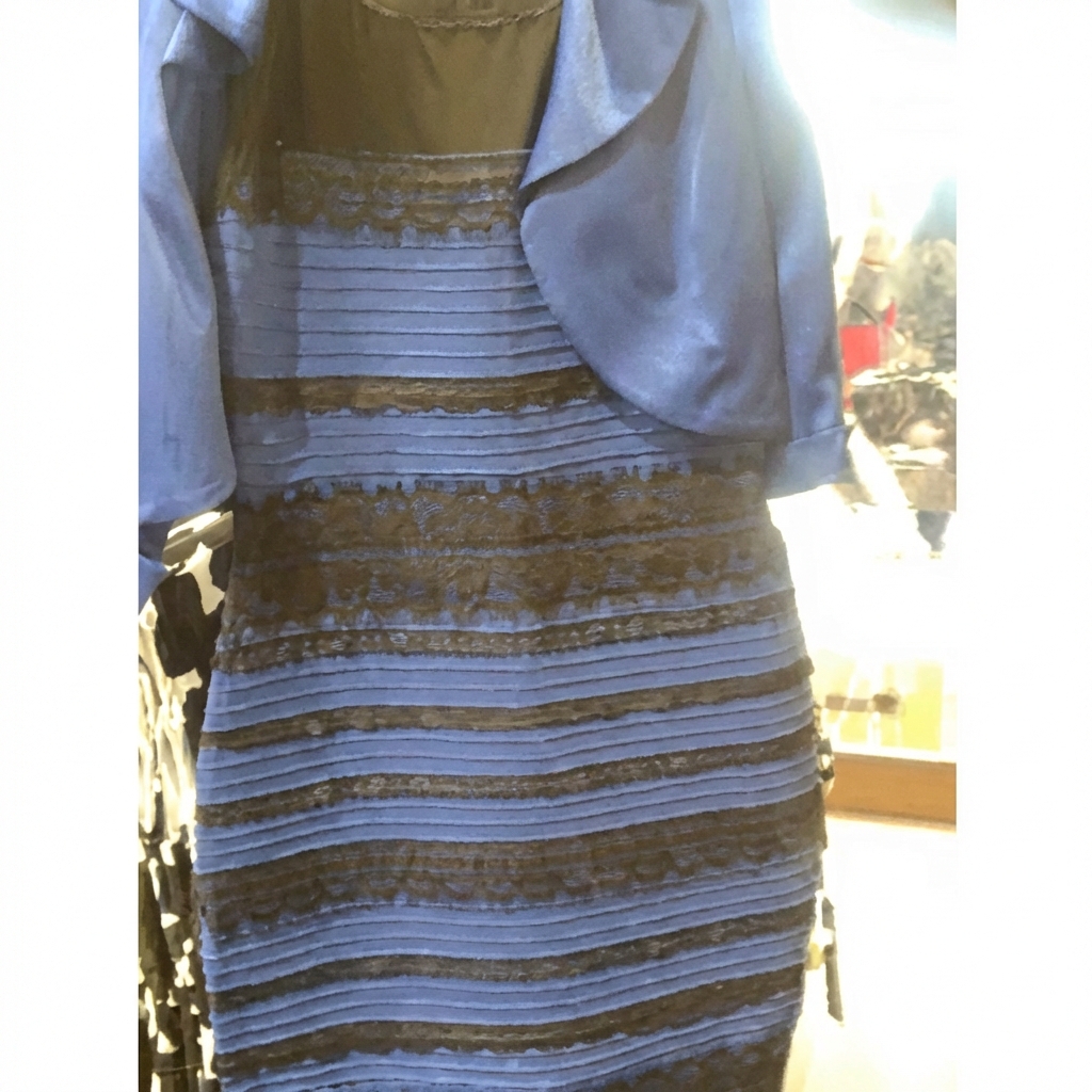
The Blue Dress Phenomenon
Original Photo
In 2015 a photo image went viral on the internet. Is the dress in the photo blue and black, or white
and gold?
The photo is a demonstration of the color constancy principle outlined in Concept 5 above. Our idea
of the colors of the dress is actually formed by assumptions about the lighting in the photo, i.e.
whether the dress is in direct sunlight or in shadow and backlit.
Concept 08
Simultaneous Contrast
Compare the hue intensity of the trapped vs. floating blocks
Simultaneous contrast describes how adjacent colors influence each other. In this demonstration, we
compare two identical reds and two identical cyans.
Notice how the blocks that are "trapped" behind the vertical bars appear different in hue and
intensity compared to the blocks that sit on top of the bars. By changing the spatial relationship
(behind vs. in front), our perception of the color shifts, even though the actual pixel color values
remain identical.
Concept 09
Simultaneous Contrast and Assimilation
الجمال
BeautyFront (Contrast)
الجمال
BeautyBehind (Assimilation)
Toggle the overlay for the yellow/gold arabic text (the Arabic word for beauty, “Al-Jamal”)
This demonstration uses the Arabic word for beauty, "Al-Jamal”, in yellow/gold text. It illustrates
simultaneous contrast alongside the visual concept of assimilation. A dictionary will often describe
assimilation with auditory references, sounds that bleed or blend into adjacent sounds. The gold
text is identical on both sides, yet our perception of it changes based on its relationship to its
surrounding pattern.
Left Side (Contrast): When the word sits in front of the veil, the gold contrasts
sharply against the dark background, appearing brighter and more vibrant. The eye perceives the gold
as more luminous because it stands in opposition to the dark lines.
Right Side (Assimilation): When the word is placed behind the veil, the dark lines
of the pattern visually mix with the gold text, making it appear darker and more muted. In this
example of assimilation the adjacent dark lines "pollute" or shift our perception of the gold
beneath.
By toggling the veil and comparing the two words, you can observe how the same color changes base on
its relationship to adjacent colors. It demonstrates how color perception is shaped by the energy
relationships between colors (a core principle of the Energy Theory of Color).
Concept 10
Relative Energy Levels
Low EnergyOriginalHigh Energy
Adjust the energy slider to shift the pattern's "greypoint"
This mosaic pattern from The Alhambra in Granada, Spain, demonstrates how shifting the overall
energy level (or "greypoint") of an image dramatically alters the relationships between the colors.
Low Energy (Left): As you shift the energy towards the darker end, the deep blues
and greens become dominant, while the gold lattice recedes into the shadows, creating a moody,
mysterious atmosphere where the "ground" becomes more substantial than the "figure".
High Energy (Right): Shifting towards the lighter end energizes the entire field.
The gold lattice becomes radiant and piercing, pushing forward as the primary figure, while the
blues and greens lose their depth and become supporting pastel tones.
Concept 11
The Subjectivity of Color Experience
Human Vision
Switch between different visual systems
We often speak of color as if it were an inherent property of an object—"the apple is red."
However, color is a construction of the mind, a subjective experience generated by how our specific
biological hardware processes light energy.
Dog Vision: Dogs are dichromats (blue + yellow-green sensitive), so reds lose
contrast and many scenes compress into yellow-blue-gray relationships. In ETOC terms, the same
physical light carries a different felt energy map for a different visual system.
Cat Vision: Cats also have dichromatic color vision and lower daylight acuity, so
warm hues flatten and fine detail softens. The simulation highlights a core ETOC point: perception
is not just color names, but energy relationships shaped by the observer.
Bee Vision: Bees read UV, blue, and green (not red), revealing nectar guides we
cannot naturally see. This art-science translation uses false-color mapping to suggest how hidden
energy structure appears when the visual apparatus changes.
Bird Vision: Many birds are tetrachromats, adding UV sensitivity to the spectrum
and expanding color distinctions beyond typical human vision. The rendering is an approximation, but
it supports the ETOC view that "what is seen" depends on the observer's sensory design.
Papilio Butterfly:Papilio xuthus has exceptionally fine spectral
discrimination across multiple receptor classes, so tiny hue differences become highly legible. Here
we compress that richer perception into visual cues that connect scientific findings with artistic
experience.
Color Blindness (Protanopia): With missing long-wavelength (L-cone) response,
reds shift toward yellow-brown and familiar contrasts reorganize. This reinforces ETOC's central
claim: color experience is subjective, relational, and built by perception.
To learn more about how researchers capture animal vision—including UV—see
Animals Can See Colors We Can't
(Scientific American, 2024).
Concept 12
The Observer
How do you see?
Every human visual system is unique. We all prioritize different relationships in light
and color.
01
08
When looking at a sunset, what captures you first?
Your Visual Archetype
Spectral Architect
You see structure in light. You perceive the world as a built
environment of energy.
This interactive assessment explores your personal subjectivity. By choosing what catches your eye,
we can infer how your visual cortex prioritizes information—whether you seek structure, emotional
magnitude,
contrast, or hidden depth.